Mali Palace
Lima Peru
BOUW: -
OPDRACHTGEVER: PARTICULIER
FUNCTIE: MUSEUM
Intro
To design a new wing for Mali Palace, an institute with a long history, is quit a thing.
As an architect I investigate how the museum and the art-school is running at this time and how the urban space is used nowadays.
Quick view
The palace is a huge characteristic building and is settled in a tough urban environment.
There is a large part fighting with the main roads to west-, north- and east side. In the course of time these roads are widened so that there is no qualitative spatial and functional integration.
The entrance of the museum at the backside is invisible should be placed in a spotlight.
Concept
Interaction by connection of the gio-urban cultural-triangle: old city-center, parks/green area and Exposition park. A complete integration of urban space and architectural volume with respect of existing historical structures. Durable solutions with an pleasant outdoor area.
Design
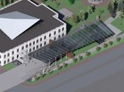
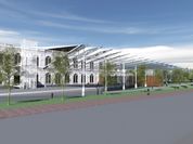
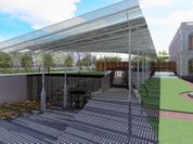
The Urban design is related to the concept by creating a long diagonal urban lane which connects the metro with park to underline the park itself as the head entrance of the museum. This longitudinal lines are related to the existing dimensions of the Palace and are related to the above structures as to the below grade structures. The above grade space is designed as an open space partly covered by an shed's-twisted-glass-roof. This space, the plaza, is designed as an outside 'chamber', an intermediar between city and art-school especially to meet fellow students. The glass roof contains 2000m2 PV-cells to generate electricity in the context of sustainability and the much needed shade.
To complete the plaza we designed a 'campanile'. A vertical glass element which contains the elevator and connects all existing and new floors.
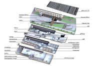
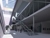
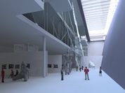
The wing itself is realized and located in 3 levels below grade. To make a connection with the historical building we designed a huge, 3 level high 'vide'. In our opinion this is the best way to show respect for the Palace. This vide is covered with glass and water. So the outside appearance is like a pond. This water can variate in high depending of the need to reduce the light.
On level -1 is the art-school entrance located as well as the second entrance to the museum. This entrance is direct connected with the metro entrance and the park by several ramps. On this level we find also the library and the gift shop. All of them connected to the vide bij a glass wall.
On level -2 we designed the art-school. Accessible by stairs and elevator. Acoustical separated by glass walls but visually connected with the vide and so connected with the museum.
On level -3 we designed the gallery and collection storage. To situate the gallery on this floor it creates a majestic space a maximum of useful surface of circulation space. The gallery is as much as possible free of columns and can easily divided in smaller gallery's. The void space is special for dramatic exhibition of sculptures and statues.
On level -1 is located separately but connected with all other functions the multipurpose space and the cafe. The cafe is connected with the park by sloped stairs. The roof is designed with a grass- and glass-roof. To locate these functions here it is easy to exploit this separately of the museum.
Circulation
The new wing is accessible via the head entrance. Here some changes especially in the restaurants have to be made. From here a traverse is created. The first part as a covered bridge which crossed the glazed roof. This traverse consists of an around glass corridor and a volume with copper perforated panels in which the stairs are located. These stairs gives access to level -1.
On level -1 the separate entrance of the art school is located.
On level -1 is also the entrance located of the new gallery by a long direct stair which guarantees a fascinating experience.
Copyright Roy Gelders Architecten © All Rights Reserved


